When illuminating commercial or industrial indoor and outdoor spaces, the choice of color temperature plays a crucial role in shaping the user experience. This detail significantly influences the ambiance, functionality, and aesthetics of the space.
In this guide, we will explore the subtle differences between different color temperatures, dissecting the attributes, applications, and optimal use cases of each option. Our aim is to assist you in selecting the option that best suits your needs.
1. The importance of color temperature goes beyond aesthetics; it’s a critical factor in both indoor and outdoor lighting. On a biological level, the color temperature of light can elicit different responses. Warm tones induce calm and relaxation, whereas cool tones enhance alertness and productivity. This is most relevant in photography and desktop publishing, where color temperature affects color rendering and reaction to visuals.
2. Space preferences shape the use of light color temperatures in different settings. Residential areas favor warm lights to create a welcoming and comforting ambiance. Conversely, cooler lights are preferred in industrial and commercial settings due to their productivity-boosting effects. Cooler lights stimulate serotonin release, akin to the effects of sunlight, promoting alertness. While warmer lights encourage melatonin production, aiding in relaxation and sleep.
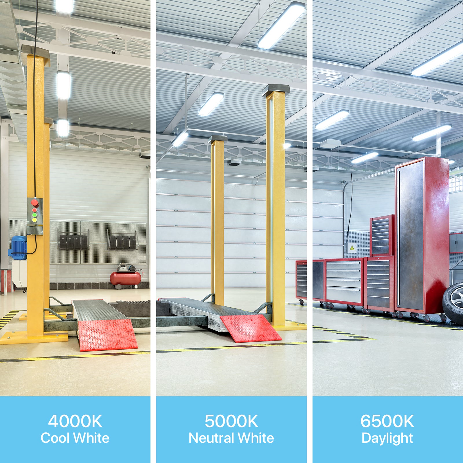

4000K vs 6500K
Both 4000K and 6500K are considered as cool lights. 4000K is renowned for its balanced, neutral light and finds extensive applications across various facilities including factories, parking lots, sports fields, and warehouses. It is particularly effective in factory settings where sustained focus and comfort are paramount.
On the other hand, 6500K emits bright blue-white light, making it ideal for environments where precision and clear visibility are crucial, such as hospitals and sterile environments. Detailed tasks necessitate intense, clear illumination.
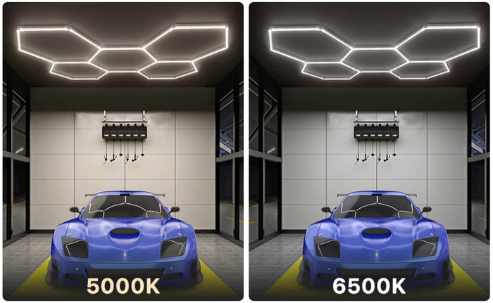
5000K vs 6500K
5000K falls between 4000K and 6500K on the color temperature scale.Comparing 5000K with 6500K, both in the cooler spectrum, the latter is brighter with a more pronounced blue tint.
While 5000K is akin to daylight, 6500K is more like looking directly at the blue sky. It is often chosen for settings that need high levels of brightness and clarity, such as hospitals and sterile environments.
For areas like retail shops, offices, and parking lots, brightness is a key factor, but the extreme intensity of 6500K is not required or desired, making 5000K often the preferred choice.

Final Thoughts: Your Space and Its Temperature Needs
Choosing the appropriate color temperature is essential in determining the purpose and ambiance. Choosing the right color temperature for your space is crucial. Please consider the unique requirements and characteristics of your space. This guide will help you choose the right lighting to illuminate and improve the functionality and design of your space.
Different color temperatures of lighting are suitable for different environments. 4000K lighting is ideal for spaces requiring prolonged focus, such as factories and parking lots. 6500K lighting is suited for areas necessitating precise visibility, such as hospitals and laboratories. Meanwhile, 5000K lighting offers a balance of brightness and clarity, making it suitable for offices and retail spaces where a comfortable working environment is desired.